Enticing people to your website is like inviting them to a party; if it’s dull, they’re going to leave. The aim is to get people to land on your website, then encourage them to want to stay.
You’ve written compelling web copy, you’ve added the right links, optimised every page and wowed your potential customer with a professional and attractive website design. But why is your bounce rate so high?
Websites are the shop window to your business and conversion rates matter. Whether it’s getting somebody to fill out a contact form or give you a call, as professional marketing experts, we understand the causes and reasons behind people leaving your site almost as quickly as they entered…

It may be something small like your contact form not working, but even just one issue that a user faces may encourage them to leave your website and find one that works quickly and is focused on usability.
Most people who visit your website will spend less than 15 seconds on the homepage before clicking away, so grabbing their attention straight away with clean, personal and functional design is going to a key contributing factor to your website success. In 2017, website design trends are predicted to focus on:
Retro works, but not too often in the world of web design. If you think your website is in need of a revamp, Media Street can help.

Many website owners make the mistake of trying to attract their users in the wrong way. Nothing makes us click away faster than an automatic video that won’t seem to stop! The web is becoming more focused on practicality, and people wish to consume content exactly how and when they choose, so think twice before blasting a video in their face, the chances are, they’ll click the back button quicker than you can say stop!
Appearing in the search engine results pages increases your chances of engagement and click-throughs, especially if you’ve got a title tag that reads exactly what the user wants. But if your page is clicked on, and it is not what is described within the metadata, the user will have no reason to sue your site and will continue searching until they find the appropriate information.
Clickbait is just that – bait. Sometimes it works, but most of the time if you’re trapping someone into entering your site, you won’t keep them there for long if it doesn’t do what it says on the tin.
The best way to avoid this problem is to review each of your pages and their metadata, then say to yourself from a customer’s point of view “if I clicked the link based on what I saw, would the page be what I expected it to be about?’
If your website takes more than 3 seconds to load, people will leave. In this digital age, we’re guilty of being impatient. Everybody is seeking quick solutions with fast results, so ensuring that your website is up to speed is fundamental. Again, as experts in the field, we can assist with this.
A good site structure means favourable user experience. When you strip back your site and take away the colours, the images and the fancy graphics, ask yourself – are you really left with a well-functioning page that is simple to use? Look at it from the user’s perspective – they want to use your products or services, but would they easily find what they’re looking for? If you’re in any way hesitant about this, you should speak to a professional web developer or marketing agency about ways to best move forward.
Don’t forget, good structure means better crawling, better crawling means better SEO results!
Content is what drives people to your website, and it’s also what will make people leave as quickly if you haven’t mastered your strategy. You only have a few seconds to tempt a user into staying, so you must be clear in what you’re offering and give them the best direction as to what they are looking for.
In order to be successful, you should experience various types of media – use words, slideshows, videos, blog posts, social content and photos.
Top tips
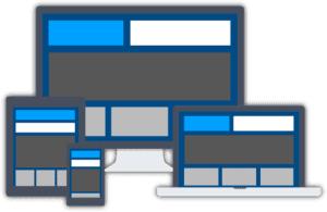
In April 2015, Google announced that unresponsive websites would suffer. This meant that any website that does not automatically fit to the size of a particular screen would suffer in search engine rankings. More than half of business emails are read on mobile devices, therefore if your website isn’t responsive to mobile devices, you’re likely to lose people quickly.

As well as content, appearance is a huge contributing factor to keeping online users interested. Minimalistic websites can be very effective and attractive to online users, consider using banners, easy to read fonts, and clear colours to maintain consistent engagement and good impressions.
You’ve enticed somebody to your website because you want them to take action, the trick is to not let them forget what it’s about or where it can be found. Clear calls to action, like contact buttons or enquiry forms, will ensure that an online user has a decision to make on your website.
Testimonials and about pages are vital to your website success and shouldn’t be ignored. If a user wants to understand a little more about the vision of your business, how will they find out without an ‘about’ page? Your website is an introduction to your services and the site must reflect your professional personality. Sell yourself, make people believe that they need to choose YOU!
Your website is one of your most important marketing assets, so if you’re failing in any of the above and require professional assistance, we are leading digital marketing experts and can help improve your results, whether you require a new website or a kick-ass social media campaign. Get in touch with a member of our team today.