With the new year steadily approaching and graphic and website design becoming more and more prevalent, it’s important to keep your company’s image up-to-date. No longer is a website just enough, everyone has a website and this is why it’s crucial that you really invest in your graphic artwork, so it stands head and shoulders above the crowd. As the rain settles on us here in the UK this February, we’ve started investigating and looking into the next big things for 2015.
The current trend, for web design particularly, is cleanliness and ‘flat’ graphics. Gradients, shadows, bevelled edges and embossing are all being left in favour of simplicity and elegance. Buttons and icons play a major role in this approach. Flash intros are a rare thing nowadays on modern sites, which allows for quicker page loading times and more control by the user.
Examples – www.hautemontagne.com, www.birdseyeviewpro.co.uk

White space and leading are on the increase and where shadows are being used, they are kept very simple looking. These features all help with navigation and aid calls to action. Banners and script fonts are very popular, and large home page images as backgrounds seem to be in vogue – it is often said that pictures speak louder than words!

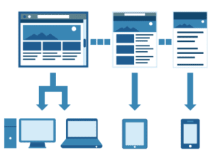
All of these things translate well to different devices, so when you are browsing a site on your phone or tablet, there isn’t too much to confuse the user. They also make it easier to navigate and choose what sections are of interest to the user. Interactive features and how they are designed are also a key advantage to modern web design. There needs to be enough to keep the user interested, but not so many as to get confused by. Simple, yet meaningful content and an easy journey to find the key information are exactly what people want or they become disengaged quickly.
Examples – www.autopot.co.uk

A good logo and consistent branding are also important, and good brands evolve with the times. Have you reviewed your website recently? Or maybe you would like some advice, in either case Media Street are happy to help. Please contact Media Street on 01392 914033 or [email protected]